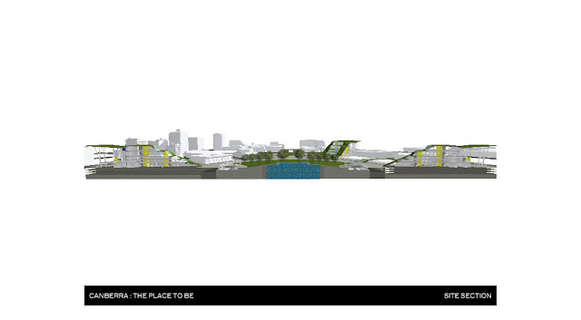
In response to the feedback I received from my tutors at my final presentation, I have created some additional drawings to illustrate the logistics of the Bus Rapid Transit terminal and the sunken roundabout.
Pictured below are 3D cutaway sections of the northbound BRT terminal at the centre of my site. The topography in Canberra is very flat (besides the iconic hills which inspired the design concept). The ground level of the city was maintained, however, Vernon Circle (the huge roundabout in the city centre which is over 200m in diameter) has been sunk by 6m. This was done in order to achieve a number of positive outcomes.
- The renewed central park area is now totally accessible to pedestrians and cyclists, whereas before the vehicular traffic on the roundabout was an impenetrable barrier
- The new BRT system sits above the plane of existing road traffic. It therefor requires 2 storeys clearance in order sit below the ground plane and have still have access to a terminal platform.
The red lines on the image below indicate the flow of pedestrian traffic.


